2-
Wheel for Reel
Print organization App & Website
UX / UI Case Study
Crafting a mobile app and responsive website for an organization facilitating custom wheelchair print purchases and community building.
My role: UX Researcher / UX & UI Designer
Duration: June - July 2023
Tools: Figma & Google Docs
.png)
%202%20(2).png)
Project overview
Problem
Wheel for Reel addresses the limited customization options for wheelchair users, recognizing a lack of awareness and choices within the community.
How can we create a platform enabling individuals with limited motor functions to shop online for personalized wheelchair accessories, allowing them to customize their wheels?
Opportunity
Create an app and website for purchasing custom wheelchair wheel prints, enabling users to upload their designs and connect through donations or swaps.

%203%20(2).png)
.png)
Design process
My role
As the lead UX designer at Wheel for Reel, I oversee the end-to-end process of conceiving and delivering an app and responsive website.
Recognizing how wheelchair users engage with digital products in their daily lives is essential for enhancing their well-being and unlocking numerous market opportunities for all users on wheels.
01/
Empathise:
User research summary
I crafted interview questions using Wheel for Reel's data on personalized medical equipment, conducted user interviews, and found that most participants were dissatisfied with digital accessibility and the medical appearance of websites. Few organizations provide custom products for wheelchairs.
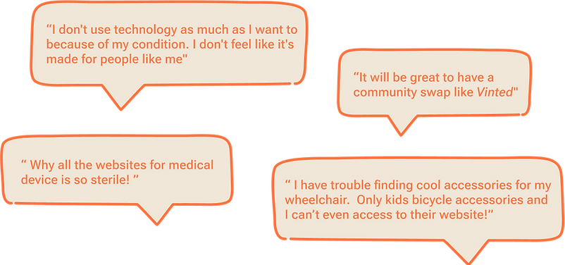
The feedback gathered from research clearly indicates that users desire to discover custom accessories for their wheelchairs and establish connections with others.
02/
Define:
Define & understand user
Creating personas enhanced our understanding of users' needs and challenges, providing valuable insights into their expectations and requirements for accessible products.

Problem statement
Charly, a fashion photographer, requires a simple method to print his own photos for customizing his wheelchair, as existing accessories do not align with his personality.
User journey map
Based on research insights, I empathized with users while creating the user journey map, revealing opportunities for improvement. Mapping Charly's journey emphasized the need for a mobile-responsive website.

Developing personas with distinct needs facilitates considering and addressing current constraints, paving the way for innovative solutions for potential users.
03/
Ideate:
Competitive audit
I explored other websites addressing similar issues to understand their approaches and identify gaps, focusing on user flow, design, navigation, IA, accessibility, and overall experience for feature ideation.
View the full document: competitive audit
.png)
I brainstormed using the "Crazy8" technique, focusing on ideas from the competitive audit to enhance product accessibility and incorporate personalization features.
04/
Prototype:
Wireframes sketches
I created paper and digital wireframes for the app, considering user pain points. These designs prioritize accessibility features and personalized navigation guidance to assist users in selecting, creating, or swapping their wheel cover designs.
.png)
Digital wireframes
These designs focused on accessibility features and personalized navigation guidance to help users choose, make, or swap their wheel cover designs.
01
Top half of the home screen act like a carousel animation displaying the new prints to engage with the users.
.png)
02
Easy access to accessibilities features menu from the bottom navigation bar and at anytime.
03
Bottom navigation bar help to access the app features at all time.
In anticipation of usability testing, I developed a low-fidelity prototype that seamlessly navigates the user through viewing a print, selecting it, adding it to the cart, and successfully completing the payment process.
*/
Visual identity:
Mood-board
The primary audience comprises children and adults who are eager to express their true selves and exhibit their personality beyond their medical devices.

Style guide
The main typeface, Montserrat Alternates, combines urban style and rounded typography, achieving a vintage and modern look for the Wheel for Reel brand. Paired with Source Sans Pro for body text, it ensures clarity in short strings with a generous width.
.png)
The vibrant color palette and bold, colorful products mirror the positive message the organization aims to convey to its community.
05/
Test:
Unmoderated usability study
I performed an unmoderated usability study with 5 participants, testing the digital prototype and user flow. The emphasis was on identifying major pain points in the user journey, with a specific focus on accessibility features.
01
People using screen reader technology had difficulty to access to the “accessibility” menu button because is located at the bottom of the screen.

>
Using insights from usability studies, I relocated the "accessibility" menu icon to the top bar.
02
People had issue to find the “search” icon option and would prefer a search bar to help user with assistive technologies.

>
I added an accessible search bar for users employing speech-to-text at any point in their journey.
Final prototype
I prioritized accessibility features, allowing users to adjust options and preferences at any time. Clear indicators of the user's location were my primary focus.
.png)
The high-fidelity prototype aims to streamline the user journey by incorporating clear labels for interactive elements. Additionally, it includes a "skip to content" option accessible for screen readers.
06/
Responsive website:
Sitemap
Having finished the app designs, I transitioned to designing the responsive website. I utilized the Wheel for Reel sitemap to inform the organizational structure of each screen's design, ensuring a cohesive and consistent experience across devices.

The information architecture decisions and objectives aim to enhance overall website navigation while prioritizing accessibility features.
Mockup: screen size variations
I designed for different screen sizes, such as mobile, tablet, and desktop, optimizing each for the specific requirements of the device and screen dimensions.
.png)
Wheel for Reel organization encourages personal confidence and self-care in an accessible and engaging manner.
.png)
Take away
Impacts
Users appreciate that Wheel for Reel goes beyond colorful wheelchair designs, offering a sense of community that reduces loneliness and fosters connections.
Coming soon! Elevating Wheel for Reel to the next stage of development, reaching every user with wheels in the market—whether it be a wheelchair, bicycle, scooter, stroller, or beyond.
What I learn
I discovered that despite the magnitude of the problem I aimed to solve, systematically navigating each step of the design process and aligning with specific user needs enabled me to devise solutions that were both practical and beneficial for everyone.
